WORK
TMUTAGA 2024: Branding, Layout, Packaging
BRIEF
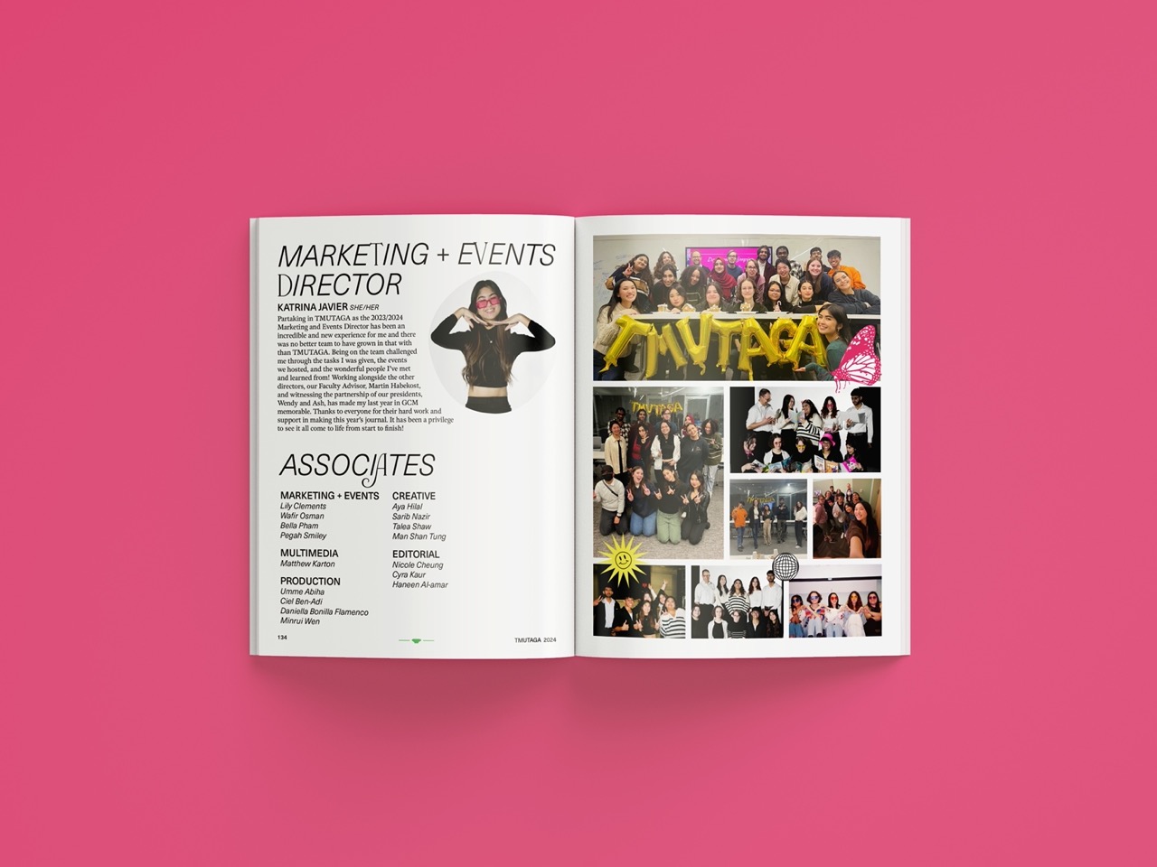
Create branding guidelines for annual journal design submitted to the TAGA Helmut Kipphan Student Chapter Competition. Design journal under team of creative associates, as well as overlook other design creations.
“Our journal’s main theme is entitled ‘Emerge’, and the design style is our interpretation of maximalism. Inspired by the life cycle of a butterfly, TMUTAGA has recently gone under a name change. One year into its rebranding, we are ready to emerge ourselves into this new rendition of this club and spread our wings. The maximalism draws inspiration from the wings of a butterfly: chaotic, loud, and colourful. We have cemented ourselves into this rebrand and we are making it known. We are emerging from our past and embracing it with shining colours.”
ROLE
Creative Director & Main Designer
AWARDS
• Journal Design
• Publication Production
LINKS
︎ style guide
︎ full journal
︎ full calendar


PACKAGING


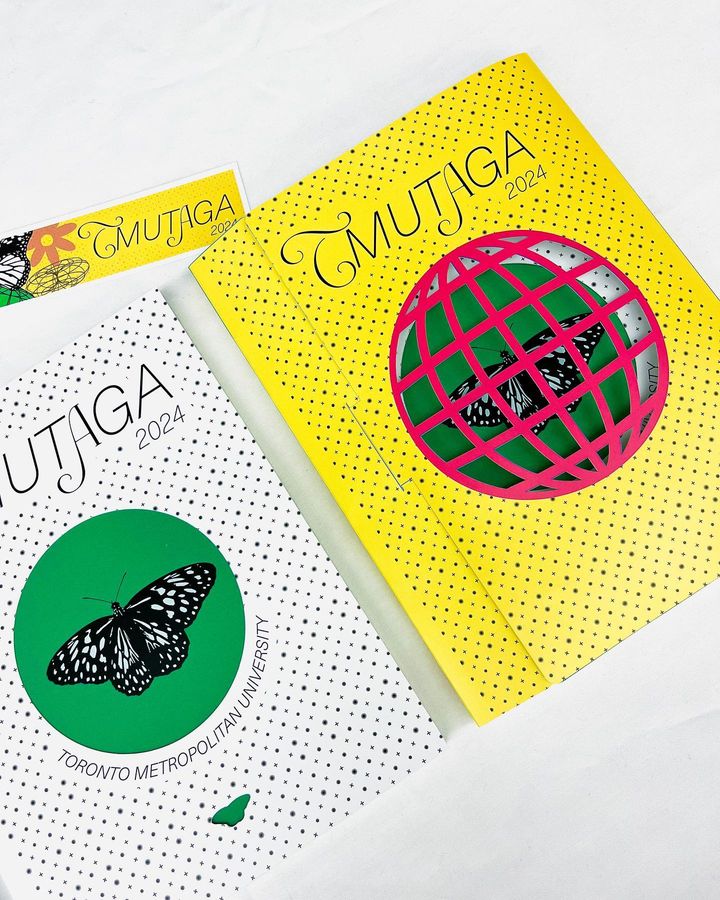
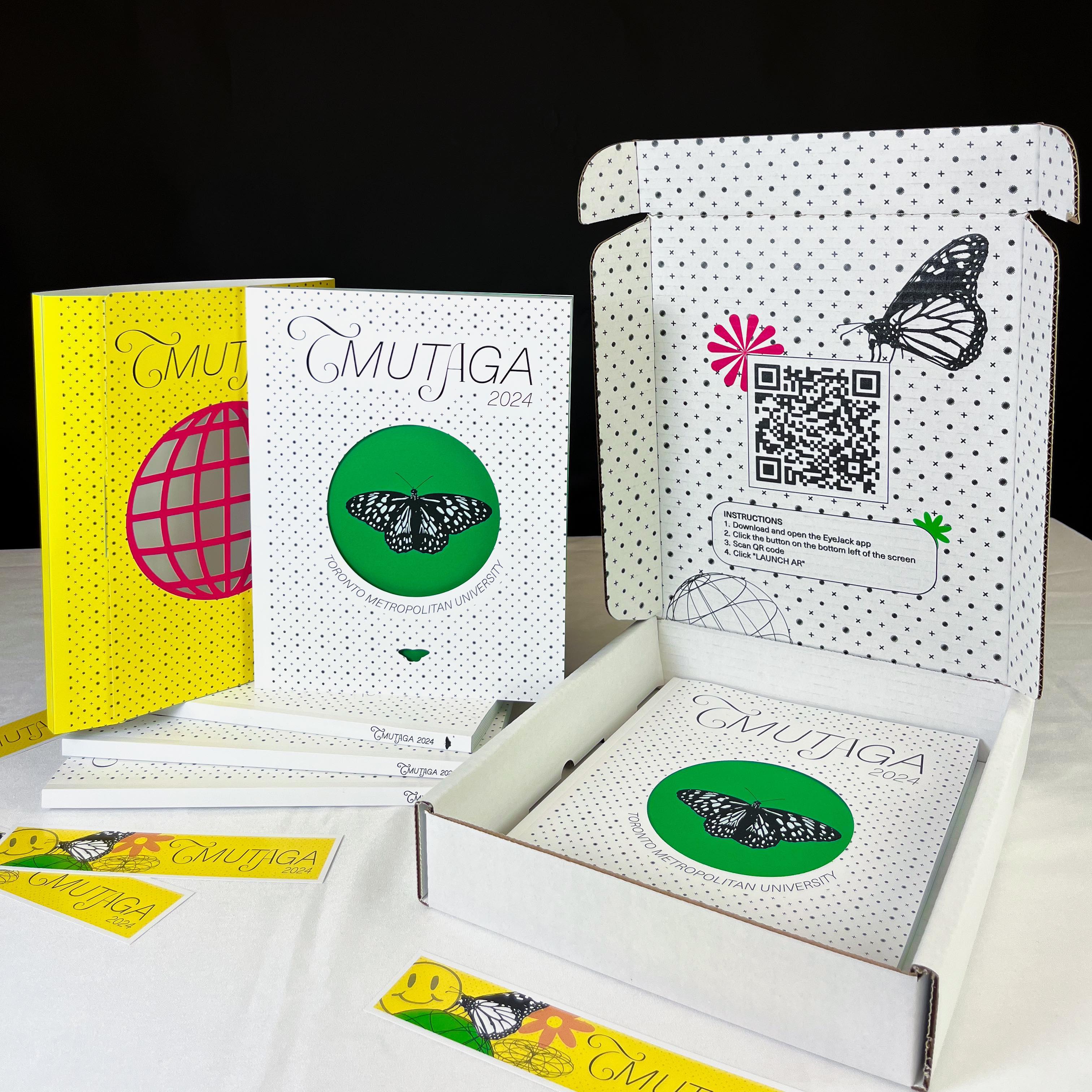
“Containing the five thesis papers of TMU, we wanted to allow the thesis papers to stand out on their own, placing the traditional black and white serif text in contrast to the maximalist design elements throughout the journal, mixing the two concepts together. The slipcover and cover tell a story; encased in a brightly coloured cage, the butterfly cannot escape until it is freed by opening the journal. The innovative and fresh ideas within the journal set the butterfly free. The elements found within the journal draw inspiration from the y2k designspace and brutalism, drawing from the notion of being loud and in your face. Lastly, the font choices were inspired by the mixing the old and new, the classy script with the modern sans serif. We are creating a new space for ourselves, with that new space comes the mesh of old and new ideas.”
FIRST CONCEPT


